News
Education & Training
Technology
Caldwell rebrands and launches new website
March 16, 2021 By Crane & Hoist Canada
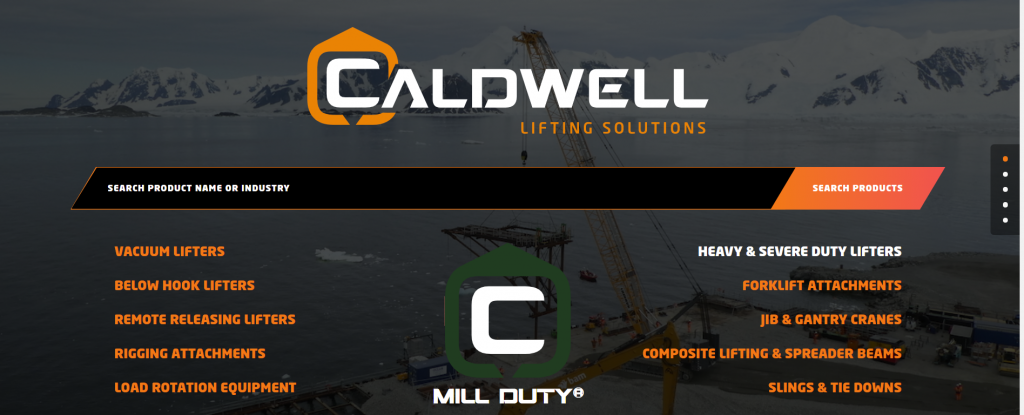 Rockford, Illinois-based The Caldwell Group Inc. has launched a new website at caldwellinc.com.
 The Caldwell Group launched its new website and rebrand at caldwellinc.com. The site features the specialist lifting equipment manufacturer’s new brand and logo.
Caldwell, a provider of standard and custom lifters, has been working on the relaunch for almost a year, having set out last spring to position the business even closer to end-users, distributors and potential partners. The new website also captures Caldwell’s status as a ‘Lifting Solutions’ provider, which is the tagline of a revamped logo.
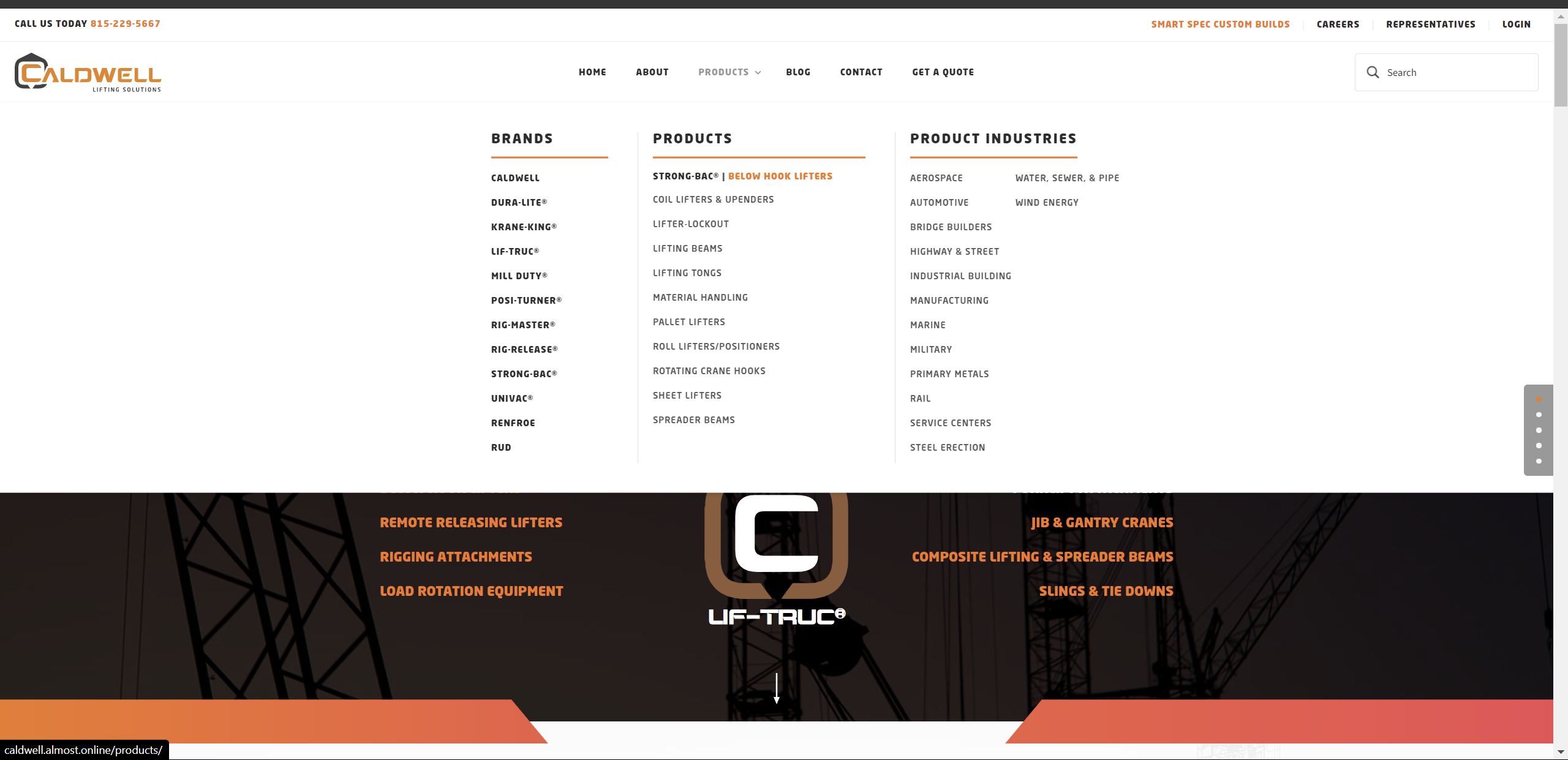
At the heart of the site is Caldwell’s full catalog of below-the-hook and other lifting equipment.
At the heart of the site, powered by web developer WeCreate, is Caldwell’s full catalog of below-the-hook and other lifting equipment, and SmartSpec, a digital tool that allows distributors to configure products. SmartSpec resembles other advanced product configurators but is unique in giving customization options to dealers specifically looking for non-standard equipment.
“As an organization, we have been putting a lot of emphasis on evolution, whether it be through our products or our internal culture. The website needed to better reflect that same mindset. Also, we keep talking about improving the customer experience—how can we make our partners’ lives easier? The website was a big part of that. The pricing and quoting aspect built into the site will ultimately help customers become more efficient, whether it’s dealers logging in to view standard catalog pricing or source custom solutions,” said Darrin Noe, director of sales at Caldwell.
“If you want a catalog product, it’s right there in front of you. If you want something a little more customizable, you can simply click a button to take you to SmartSpec. And if you’re hunting for a full-blown, one-off system, you can contact our sales staff from that same window. We want to be the worldwide leader in providing lifting solutions and the old website didn’t reflect that. The new one does,” he added.
The new logo’s color theme represents continuity of the brand’s identity, while also indicating towards a new era and direction for the company.
Rebrand
Noe explained that the new logo’s colour theme represents the continuity of the brand’s identity, while also indicating a new era and direction for the company. He credits Jose Pelaez, a Minnesota-based designer with the ‘slung C’ concept, versus the more tightly cradled look of the old logo. Pelaez provided a rendition of the logo that was slightly edited into what it is today. The modernized sling look originated from his work, however.
“Lifting Solutions is what we do and who we are. Whether it’s a simple pipe tong or a complicated lumber lifter, we provide solutions for your lifting issues. The new website and brand collectively chime with that ethos,” said Noe.
Print this page